When Design is a Core Value Proposition
I generally don’t believe in “beautiful” apps.
Don’t get me wrong: I appreciate good visual design. As a designer, I love it when apps look great; projects like my morse code keyboard are certainly intended to look good. From a product standpoint, it’s hard to deny that building a social networking app or similar basically requires chasing fleeting app design fashion trends in your endless pursuit of eyeballs.
I’m talking about building “applications”, though. Utilities that exist solely to perform some useful task. Working within that framework, whether it’s on a client project or my own work, it’s rare that I’ll invest the extra time to elevate an app’s design from “clean and not unpleasant” to “lickable” or “gorgeous”. It’s an argument that I have a hard time swallowing: once your visual design is sufficiently not-terrible that it won’t turn turn people off of your product, it’s rare that the extra difference is going to add real value to your users or convince them to use your product over someone else’s.
There are times I’ll be the first to admit this isn’t the right approach. I find those exceptions fascinating.
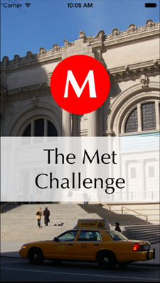
Met Challenge
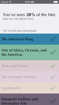
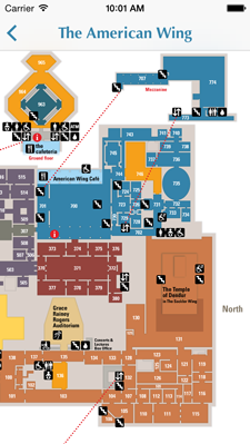
I recently built an app called Met Challenge. The idea behind it is simple: it helps you keep track of which parts of the Metropolitan Musem of Art you’ve seen. The app contains little more than a list of every section in the Met, organized by floor. Tap the name of a wing and you’re shown on a map where it is within the musem. Swipe across the name of a wing or tap the checkbox next to it and you’ll mark it as seen. A percentage counter at the top lets you know how much of the Met you’ve seen to date.
To be clear: this is an app whose functionality you could roughly replicate with a pencil and one of the paper maps they give out for free when you enter the museum. And yet, this app has helped get me in the habit of going to the Met on a weekly basis, far more effectively than other methods I’d tried.
Why do we go to museums?
Going to museums is an aspirational activity. Viewing art is intrinsically rewarding and valuable for a lot of reasons, yes. No arguments from me there. But the desire to go to a museum is also wrapped up in fuzzier, more psychological motivations.
There is cachet in being the sort of person who goes to art museums, at least within my (relatively privileged) socio-economic and generational cohort. If you enjoy thinking of yourself as a sophisticated, intellectual urbanite, the act of going to an art museum can serve to reinforce that sense of self.
If part of the enjoyment of going to a museum is being able to fulfill those superficial identity politics, it’s not hard to see how we can use visual design to play into those desires. Met Challenge tries to approximate the sense of sophistication that permeates the visual design and branding of museums; I aimed to create an experience where opening the app felt like you were reading a museum-provided pamphlet. As a result, it’s an app that I enjoy using, and thus one that ultimately succeeds at getting me to go to the Met more often.
Other applications
While this is a very specific example, it’s easy to see how this same concept can apply in other applications. The process of buying something on a site using Stripe’s integrated payment widget, for example, is nice enough that it almost makes me want to buy more things. We live in a weird age where consumption can serve as a form of self-expression, and playing into that by making people enjoy the act of paying for things is a great way to increase conversion rates1.
While making Excel prettier isn’t going to make more people want to use Excel, there are cases like these where a bit of pointed visual polish means that users feel good about themselves when they use your tool. This will probably make them more likely to do so in the future.
Does this feel dirty and manipulative? A little bit. In the case of Met Challenge, I’m okay with it: I’m tricking my lizard brain with what feels a bit like a cheap psychological trick, but I’m doing so in the service of getting myself to go look at and appreciate art, something I find intrinsically valuable and meaningful on its own.
-
It’s worth noting that the real success in Stripe’s design is more to UX improvements, rather than visual design, but I’d argue it’s the “lickable” modal UI, complete with its subtle animations and constant feedback, that make it so satisfying to use. I haven’t built anything on top of Stripe, so I can’t speak to concrete conversion numbers, but I’d imagine their UI could in the right circumstances make a big difference. ↩