Doobers and Doors: Microinteractions as Game Reward Systems
Back when Zynga games were the cutting-edge of Facebook games, they were mighty proud of a feature called “doobers”. In Zynga’s “Ville”-style games (FarmVille, FrontierVille, CastleVille, etc.), most actions result in some sort of bonus: money, experience, resources, etc. At one point, some product manager hypothesized — backed by obsessive user metrics, I’m sure — that there was a connection between the number of clicks a user made and how emotionally invested they were in the game.
As a result, the 2010 game FrontierVille innovated on the “click to get lots of things” formula in a key way: every one of those little bonuses you earned was represented as a small icon that burst forth in a suitably friendly animation from the click target. In order to get your bonus, the game suggested, you needed to click on each of those little collectible items (that was not, in fact, the case — they would be auto-collected after a few seconds — but that was conveniently not explained to the user).

Now, doobers aren’t a particularly good idea. Forcing users to do extra work for the sake of it is silly. In fact, later Zynga games replaced doobers with “hoovers”, doobers that are collected by hovering over them rather than clicking them, so they require less drudgery. Even with that tweak, I’d be hard-pressed to say that blatant dopamine-release trigger (“HERE ARE A BUNCH OF SHINY THINGS EXPLODING EVERYWHERE BECAUSE YOU CLICKED”) is a Good Game Design Thing. Especially in context of Zynga’s games, where their entire goal was to get you to enjoy clicking on things as much as possible so you would eventually pay them more money to click on even more things.
That being said, I noticed recently a similar mechanic that had been tweaked to be a much more empowering and less exploitative force for motivation.
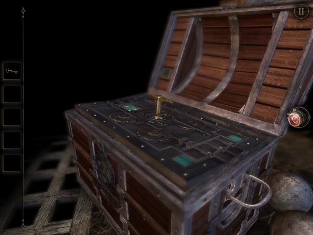
I’ve been playing through The Room 2, a pretty nifty iOS game where you solve puzzles by pushing and prodding at digital versions of old-timey switches, levers, locks and other mechanica in an eerie, ominous environment. If you haven’t played it, I highly recommend it (though I’d probably start with its predecessor first).
A lot of the puzzles in the game end up unlocking some sort of container (a drawer, a chest, etc) upon completion. When you put a key in a keyhole and turn it, for example, a veritable cornocupia of exciting things happen: you get to hear both a satisfying ‘click’ sound and some other audio to indicate you’ve done something cool, and the drawer/lid/etc in question springs open with a satisfying bounce.

Here’s the important bit, though: it doesn’t open all the way. Just a crack. Enough to let you know that hey, this is a thing you can open. This is a really suble distinction, but it’s vital. It’s the difference between the game feeling like you’re just following along a rote, linear path towards the end (which, admittedly, you are), and feeling like you have autonomy.
In theory, this is the same essential mechanic as a doober. The game has taken a reward for doing something correct that could be made automatic, but instead forces the user to complete some trivial action. The feel is distinctly different, though.
I think it’s because of what happens after the action trigger. With Zynga’s games, the reward is the end of that transaction. You do something, you get a reward, you’re done. With The Room, unlocking a chest is just the entrypoint into yet another puzzle. Because of that, this micro-interaction doesn’t feel belabored, like the game is trying to lengthen your sense of reward (although it totally is), but rather that it’s given you an invitation to continue that you can pursue at your own pace.